
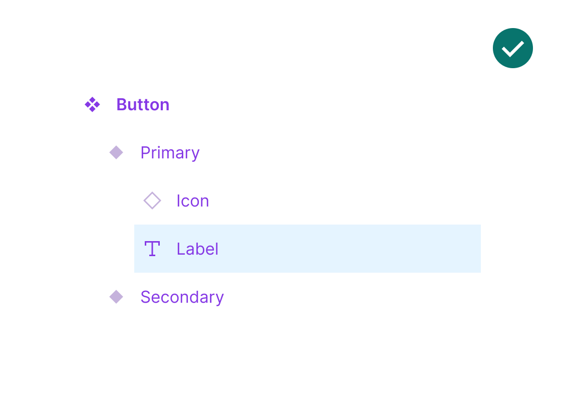
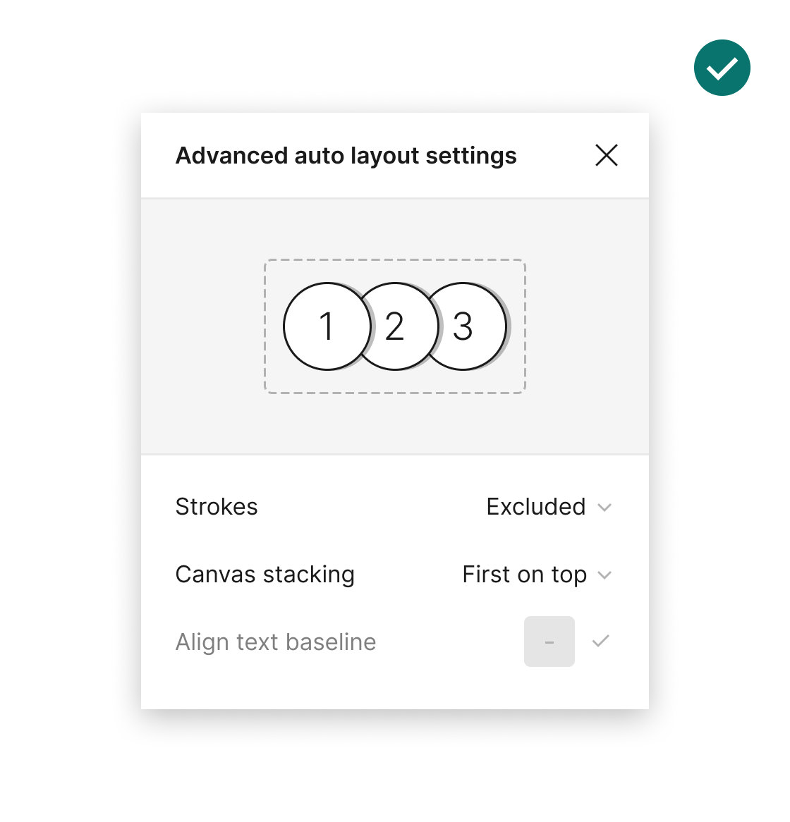
Layers order match visual layout
Ensure the order of layers can help identify which element is which on the canvas. For example, you can decide to match the top to bottom order, mixing this with left to right.